Scholastic: A Refined Script Font for Elegant Web Headlines
It started with a hero section—just me, a new coaching website mockup, and a blank headline space begging for personality. I’d already chosen a clean, highly legible sans serif for body text and navigation, but the top-of-page statement needed warmth, intention, and quiet confidence. That’s when I reached for Scholastic. Not as a decorative afterthought, but as a deliberate voice—one that could carry authority without shouting, elegance without pretense.
What Scholastic Brings to Digital Branding
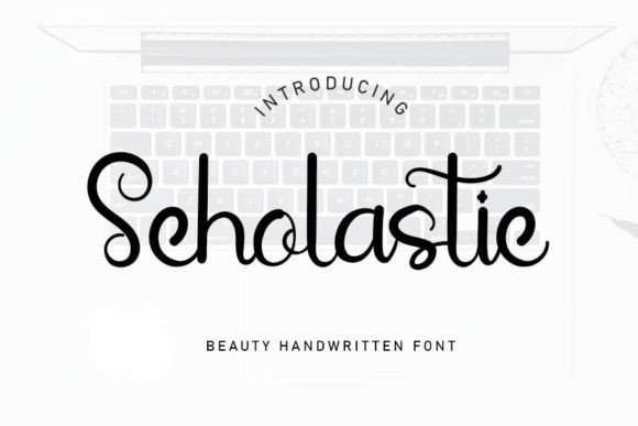
Scholastic is a premium script font from the Script Amp collection, and its strength lies in its restrained sophistication. Unlike bouncy, high-contrast scripts that demand attention through flourish alone, Scholastic balances graceful letterforms with subtle structure—moderate contrast, even spacing, and carefully considered entry/exit strokes. It feels hand-drawn, yet precise; timeless, yet contemporary enough for a modern portfolio or boutique online store.
I tested it across real web contexts: a product landing page headline layered over a soft-focus background image, a “Welcome” banner on a digital brand kit preview, and the primary CTA button on a course sales page. In each case, Scholastic added tonal clarity—it didn’t just say *what* was being offered, but *how* it felt to experience it: thoughtful, intentional, human-centered.
Where Scholastic Shines (and Where It Doesn’t)
This isn’t a workhorse font—and it shouldn’t be. Scholastic excels as a display font, not body copy. I used it exclusively for short, high-impact text: section headers (“Your Journey Starts Here”), logo lockups (paired with a minimalist sans), and hero statements. At 36–60px on desktop and scaled thoughtfully down to 28–32px on mobile, it remained crisp and legible—even over textured or gradient backgrounds.
But I also tested its limits. At under 24px, especially on smaller mobile viewports or low-DPI screens, some of the finer connections between letters began to blur. And while it handled light-on-dark beautifully with proper letter-spacing tweaks, I avoided using it for form labels, navigation menus, or dense paragraph blocks. Its charm lives in brevity and intention—not volume.
- Perfect for: Hero headlines, section titles, logo wordmarks, testimonial quotes, email subject lines (in branded templates), and digital ad banners
- Less ideal for: Body copy, small UI labels, accessibility-critical interfaces (like error messages), or any context requiring rapid scanning of complex information
Pairing Scholastic Thoughtfully in Web Layouts
A great script font only sings when supported well—and Scholastic pairs beautifully with purposeful restraint. I paired it consistently with Inter (a highly readable, open-source sans serif) for all body copy, buttons, and supporting interface elements. The contrast worked instantly: Scholastic brought character; Inter delivered clarity and speed.
In one project—a refined online shop for handmade ceramics—I used Scholastic for product category headers (“Stoneware Collection”, “Glaze Notes”) and Inter for descriptions, pricing, and CTAs. The result? A visual rhythm that guided the eye naturally while reinforcing brand warmth and craftsmanship. For a more editorial feel, I also tested it alongside a gentle serif like Playfair Display—ideal for blogs or storytelling-focused sites where tone and texture matter deeply.
Technical Considerations for Real Projects
Before deploying Scholastic in production, I checked what came in the package: OTF and WOFF2 files (essential for web use), a full set of standard ligatures, discretionary alternates, and basic multilingual support (including extended Latin characters). No variable font axis—but the included weights (Regular + optional Italic) were sufficient for most branding needs.
Licensing was straightforward: the commercial license covers web use, client projects, SaaS dashboards (as display text), and digital templates—as long as end users aren’t granted the font files themselves. I confirmed this before adding it to a client’s Figma design system and embedding via self-hosted CSS.
Performance-wise, the WOFF2 file clocks in at under 45KB—light enough to load quickly, even on slower connections. I ran Lighthouse audits before and after: no measurable impact on CLS or LCP when used sparingly and responsively. Just remember to define fallbacks (font-family: "Scholastic", "Inter", system-ui, sans-serif;) and test rendering across Safari, Chrome, and Firefox.
Real-World Impact on User Perception
Here’s what surprised me most: how often users commented—not on the font itself, but on the *feeling* it created. On a coaching site, visitors described the homepage as “calm but confident.” On a digital brand kit preview, a client said, “It makes my work feel more intentional—like every detail matters.” That’s Scholastic doing quiet, strategic work: shaping perception through typographic nuance rather than visual noise.
It doesn’t shout “look at me”—it invites pause, recognition, and resonance. In an era of algorithm-driven sameness, that kind of authenticity is rare. And for web designers building brands rooted in care, craft, and clarity, Scholastic isn’t just another script font. It’s a subtle, reliable tool for saying more—with less.